Anatomy of a Bond Movie

It’s January 2021. It’s almost a year into the pandemic in the UK, we’re in lockdown, and we’re finding ways to stay busy and entertained. Over the last few weeks my young man took a fascination with Bond Movies, and we’ve end ended up watching all the PG ones at a rate of almost 1 per night.

This starkly revealed the formula for a Bond Movie, as they very clearly all follow a pattern of similar events and constructs.

I decided to capture it on paper. It fits pretty well with the 15 or so we’ve seen so far.

Anatomy of a Bond Movie: most of the movies seem to follow a generic formula

Anatomy of a Bond Movie: most of the movies seem to follow a generic formula

Occupational Risk in Relation to Coronavirus COVID-19

I written a fair bit (and analysed a whole lot more) of the COVID19 situation and data but not published here because, frankly, the minute it’s published it’s out of date. Moreover, even using official data sources such as John Hopkins University, there’s a kind of “data entropy” at work, where data volume increases over time, but quality reduces. I could do a whole post on that topic alone, but that’s for another day.

Meanwhile, the Office for National Statistics (ONS) published an intriguing data set that quantified the nearly 400 occupations in the UK and, amongst other things, classified the type of contact with other people that workers had:

  • proximity (ranging from touching to close distance to no close contact with people at all),

  • and exposure ranging from many times a day to weekly/monthly/yearly to never.

This data can be explored interactively on the ONS website but I’ve also tried to produce some static readouts here, although it’s quite a challenge to compress this amount of data into a one-page visualisation! So, you will see a number of variations.

As the debate intensifies over whether to start schools up or not, it’s interesting to note that teachers and classroom assistants are basically in the next tranche of most-at-risk workers, behind the healthcare, police, cleaning and delivery key-workers that have kept critical services running. Many questions still remain (at the time of writing) as to the level of risk posed by the children they will mix with. Children, although seen to be less susceptible themselves to the disease, are certainly not immune.

HOw does pay compare for those potentially most-exposed. Redder, larger, more-to-right = more at risk. Lower down = lower pay.

Coloured by risk and size by percentile (% figure means x% of workers have this risk or higher)

coloured and ordered by risk, Sized by number of workers in sector.

OccuPations sized, sorted and coloured by risk

Occupations sized and sorted by sector size, coloured by risk

Some cautionary notes come with this data:

  • Risk profiles were actually collated from American workers, so difference in process and work-style could mean UK workers have a different profile.

  • The risk profile was devised prior to COVID19 and doesn’t take account of any potential social distances or other safety approaches (e.g PPE) that may be applied to a given occupation. So, in some sense, the risk score indicates what degree of protection could be needed.

If you are a Londoner, this may make you cross [fire statistics analysis]

The tragedy at Grenfell tower ( https://en.wikipedia.org/wiki/Grenfell_Tower_fire ) has turned a lot of attention to what has been happening in the fire service. There are numerous claims of improved performance, and counter claims of "fiddling the figures". So, the question is, what does the data really look like?

FRA (Fire Rescue Authority) and FRS (Fire and Rescue Service) data is publicly available at https://www.gov.uk/government/statistical-data-sets/fire-statistics-data-tables

There are many many tables and sheets of data available, and it has been a challenge to keep this "brief".

The data above covers the whole of England, broken down by authority. The starting point is to accept the data and take it at face value, before performing analysis and drawing conclusions. Indeed, analysing the data can help to determine its integrity.

There are various caveats associated with the data as it is provided, and these need to be understood. Indeed, something that is quickly apparent, is if you don't know how to handle this data correctly, you will make mistakes and errors that will lead to incorrect conclusions. I can say this with authority, because I made a few initially! 

Simple things like changes in capitalisation of dimensions between time periods, can cause aggregation to fail. Similarly, much of the data contains totals as well as broken down data, causing the risk of double counting for those not paying attention. Finally, most of the sheets do not have raw data, but have year by year drop downs - necessitating copious amounts of copying-and-pasting to reassemble the underlying information.

What changed when?

Much public discourse has been made of the fact that accounting systems changed, particularly during the tenure of Boris Johnson as Mayor. Indeed, the accounting system did change, from a paper based one to an online one (2009/10), which ultimately has provided greater granularity and timeliness. In my opinion there is no obvious attempt to "cook the books" due to the change of this system of recording.

Further discourse has covered the classification of fatalities, with the claim that, for example, fatalities later in hospital began to be omitted from statistics. Neither the accompanying notes, nor the evidence from the data supports this hypothesis.

Indeed, the data includes non-fatalities as well as fatalities, and classifies the former into different types, which includes the nature of the hospital treatment. It is hard to envisage such a well-classified data set, collected from 10's of individual authorities purposefully being manipulated to consistently exclude one type.

Note - due to the fact that injuries can become fatalities quite some time after the initial event, data for the most recent year is not necessarily complete. Fatalities may rise in due course, while injuries decrease. For the present year at the time of writing, ending financial year April 2017, data is considered complete up to January 2017 (thus is lower overall than previous years)

So we can dispense with introduction and get to the meat of this subject, the notes from the data sheets themselves are posted at the end of this page.

Let's look at the data - England - the broad trends

The first chart is total Fatalities due to fire, in England, over the period since 1981. The chart below includes a computed trendline to best-fit the pattern.  Over the last 38 years, overall fatality has, basically, steadily fallen.

We can see that same data, now broken down by location type; and this is one of the first of several important steps in making correct sense of the data. Prior to 1999, data is only available as a whole for dwellings. But subsequent to that, it is classified by dwelling, road vehicle, other building and other outdoors.  This important, because I want to focus on dwelling fires.

Looking at fatalities naturally leads us into considering non-fatal injuries as a comparison.

Here the story is rather interesting. The first point to note, is that prior to 2009/10 and the introduction of the online reporting system, we did not have any sub-classification.   This does open the door to potential misuse of the data - e.g. to compare "severe hospital" injuries post 2009 with "all injuries" pre 2009 and claim an astonishing drop.  However, if one were to do that, the discontinuity would be so great, that it would be immediately obvious. In contrast, the properly aggregated data shows the same post-1989 falling trend in injuires as with fatalities.

Perhaps of equal interest in the above chart is the steep rising trend in injuries from 1981 - 1998.  The data itself does not give the answer to why this happened; undoubtedly numerous factors are responsible. (Amongst those reasons may be changes in fire regulations, and for those who wish to explore them, a summary can be found on wikipedia https://en.wikipedia.org/wiki/History_of_fire_safety_legislation_in_the_United_Kingdom)

The shape of this chart is likely to lead some readers to suspect malfeasance is afoot. However, as before, while we see a reversal in trend, we do not see a marked discontinuity; rather a turning of a worsening situation to an improving one - which is of course the intended effect of fire regulations and fire prevention policy. In truth, we should be glad to see this effect.

The natural next step is to plot fatalities and non-fatalities against each other to see any correlation. Here I have broken the data down into decades (by colour).

Looking at the 80's and 90's what we see is a trend that is most probably a result as a focus on fire fatality prevention. As fatalities decrease over those two decades (starting at the far right and working left), injuries increase. You can plot a fairly good fit trend line through the brown and blue marks, which tends to suggest that fatalities were being "turned into" injuries. I.e. the seriousness of the worst fire injuries were being reduced.  Many factors could contribute to this trend, such as improved fabrics and materials, improved building materials and building standards. (e.g. measures such as fire doors which delay the impact of fire, thus reduce risk of death but may not prevent injury from smoke).

Then we have the inflexion point at the turn of the millennium, where the previous rising injury trend is fully reversed. Now fatalities AND injuries are falling.

It's tempting to suppose this sharp turn is mysterious, but perhaps it is not as sharp as we might think: there is a cluster of 10 or so points at the turning point of this chart, representing a whole decade turning fate around.  It is not the turnaround I find most surprising, but the sharp descent as we come into the 2000's and 2010's. Here the improvement in injuries is as rapid as the worsening was pre-2000. This must surely be attributable to some significant interventions?

One that I particularly suspect is the introduction of smoke alarms. Smoke is a key cause of injury, and the availability of an early warning to escape smoke injury must likely have a dramatic effect. Indeed, smoke alarm ownership rocketed during the 1990's.

Causes of Fire

Once again, for the curious, we can look at general causes of fire, before looking specifically at dwellings. This can help us understand whether factors outside the control of the individual (such as home wiring, manufacturing standards of appliances etc.) have a role to play.   Causes of fire are shown below. I have chosen to show them as a percentage of all recorded primary fires, so that any relative rising or falling trends can be seen.

Unfortunately the data contains a large number of "other/unclassified" records, so I have replotted the chart with that line removed (data NOT recalculated).  The new plot seems to suggest cooking appliance fires on the rise, but we shall below, all is not what it seems.

If we now look at causes of fire, but this time for dwellings only (with "other" still included), well, that's different picture - this time we see a much flatter line for cooking appliances; though perhaps not surprisingly they account for 50% of dwelling fires.

Somewhere along the line I expected to see smokers' materials drop too (especially with the advent of e-cigarettes), but that actually seems to have changed little. Electrical distribution causes have risen slightly over the period. Again, in the light of revised building standards, this seems counter-intuitive, but on the other hand, older buildings continue to age and presumably increase in fire risk from older wiring. 

What's happening in London?

The data above sets the broad context for the events that triggered this article. The analysis above has not found any obvious discrepancies in the data. That is not to say that data, or portions of it, could be used and quoted out of context, either deliberately or inadvertently. But that is left for the reader to judge for themselves.

One of the key thrusts of discourse surrounding London fire and rescue services has been the budget cuts imposed. The headline budgets, of course, go towards vehicles, premises, equipment, training, staff etc. We have data for staff for Greater London - which speak for themselves.

Stepping back, you can't argue that while there have been cuts to fire service staffing since 2010, fire fatalities and injuries have continued to fall, suggesting that the cuts themselves have had no impact.  This is probably an unwise conclusion, for various reasons:

  1. The fall in fatalities and injuries, as we saw earlier, is part of long term, nationwide trend stretching back at least 36 years. Other factors, which improve fire safety, are clearly at work here; and cuts to budget may simply be serendipitously "riding on the back" of the general trend.  Removing "slack" in the service has a certain logic to it, but cutting too deep can only have negative consequences in due course. 
  2. The fire service does not just provide reactive response but also proactive preventative measures, such as education and fire-checks. Unlike "fire response", proactive measures have a longer term, delayed impact and the effects may not be seen until several years down the line.
  3. The fire service is essentially an insurance policy. It needs to be there when you need it, otherwise it is not effective insurance. By definition this implies it must also be resourced at times when it turns out not to be needed.

The data shows that both reactive and proactive functions have suffered during the time period of budget cuts. The chart below shows response times in minutes (x axis) vs. number of incidents in a given year. Broadly, incidents have been falling, so higher incidents (y axis) are earlier in time.  

When you look at the cluster around 6.5 minutes, all of which occurs from 2010 onwards, you can't help but think someone made a conscious decision that 6.5 minutes was the target response time. Sadly, the data is not available to look at the actual distribution. 

The conclusion here is stark, response times have increased from 4.5 - 4.7 minutes to 6.5 - 6.7 minutes DESPITE the number of incidents decreasing.  This suggests that cuts have not simply been to remove "slack", but have been much deeper, to the tune of 40% or more worsening of average response times.

Proactive measures

Interestingly, there are reports of 25% reduction in fire inspections as a result of budget cuts ( http://www.mirror.co.uk/news/uk-news/tower-block-fire-safety-checks-10641046 ).

However, the number of inspections itself does not tell the whole story, because the quality of those inspections may also matter. The available data actually reports number of inspections (not broken down by type, sadly) and also number of hours performing inspections. These are plotted together below.

So, here’s a classic kind of chart which lets you tell whichever story suits your purpose: over the period 2010 - 2016, fire inspections have actually increased on aggregate. If you are a politician, that would be a good number to quote.

But the number of hours spent performing them has radically fallen, by 56% on the 2010 level, and 58% on the 2013 level.    This means a 2016 inspection was being performed in well under half the time It was 5 years previously. One might question whether quality suffers as a result, or if something else has transformed the nature of inspections.

For me, personally, this is the most telling, and I hazard-to-say, shocking insight.  The door is open, potentially, for some form of technological solution to have slashed the time taken to perform inspections, but there has been no other evidence forthcoming to support this position as yet.

Regrettably it leaves my analysis somewhat inconclusive, and we sit and wait for promised enquiry to reveal a deeper set of facts about the events and context surrounding Grenfell tower. We can only hope that we do get those facts.


The statistics in this table are Official Statistics.                                                                    Source: Home Office Operational Statistics Data Collection, figures supplied by fire and rescue authorities.

Contact: FireStatistics@homeoffice.gsi.gov.uk                                                                        

Next Update: Autumn 2017

The full set of fire statistics releases, tables and guidance can be found on our landing page, here-                                                                                        

https://www.gov.uk/government/collections/fire-statistics                                                                                        


Financial Years                                                                                        

2015/16 refers to the financial year, from 1st April 2015 to 31 March 2016. Other years follow the same pattern.                                                                                        

Note on 2009/10:                                                                        

Before 1 April 2009 fire incident statistics were based on the FDR1 paper form. This approach means the statistics for before this date can be less robust, especially for non-fire incidents which were based on a sample of returns. Since this date the statistics are based on an online collection tool, the Incident Recording System (IRS).                        

General note:                                                                        

Fire data are collected by the IRS which collects information on all incidents attended by fire services. For a variety of reasons some records take longer than others for fire services to upload to the IRS and therefore incident totals are constantly being increased (by relatively small numbers). This is why the differing dates that data are received by is noted above.        

Note on Imputed figures

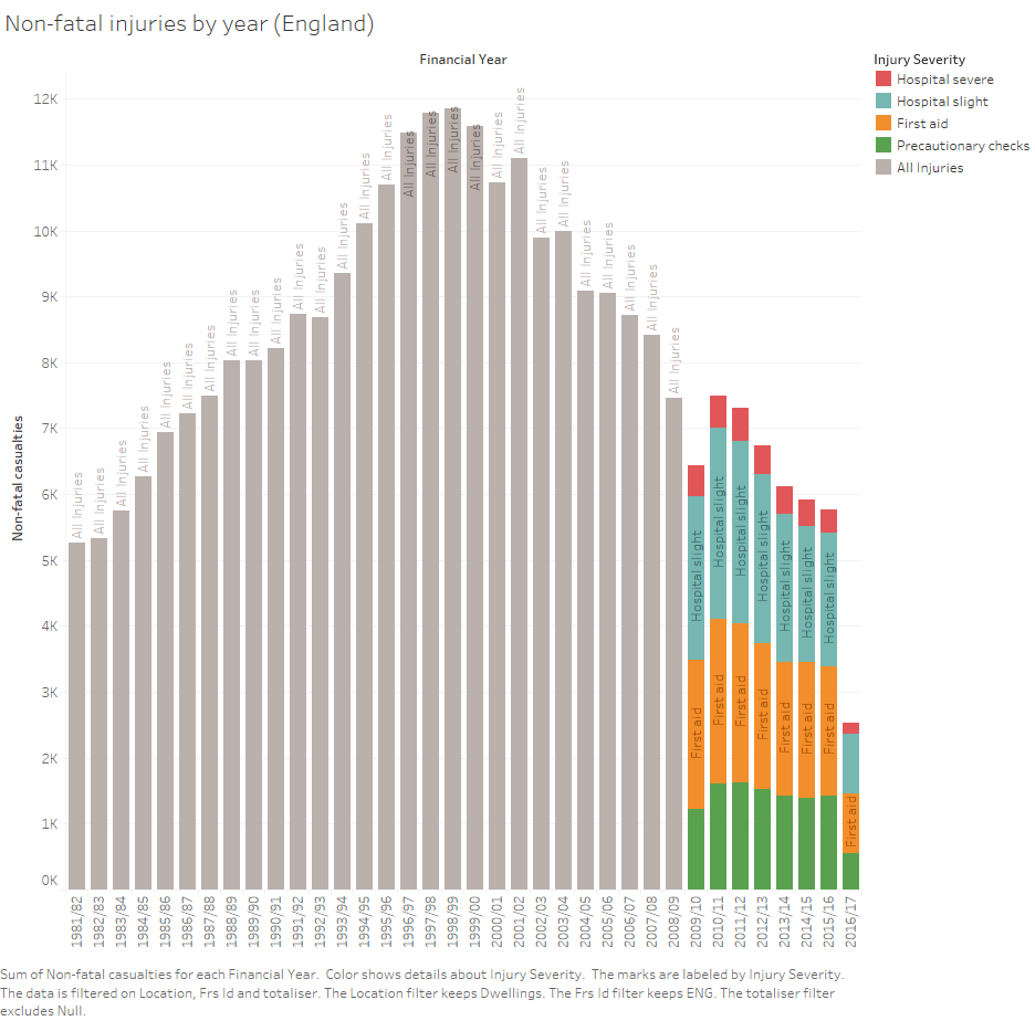
During 2009/10, Greater Manchester and Hertfordshire Fire and Rescue Services were unable to fully supply their casualty data. As such totals for these Fire and Rescue Services were imputed. For these imputed records detailed breakdowns are not available. As such, some detailed breakdowns may not sum to their corresponding totals.                                                   

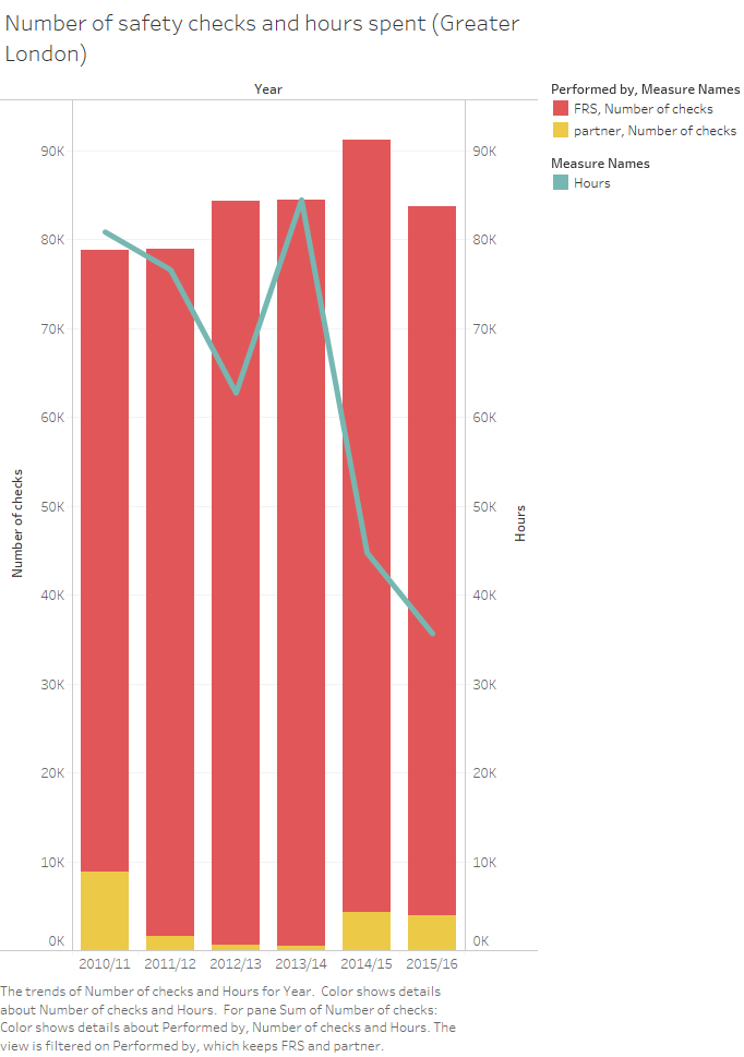
The England total hours figures above for "Number of Fire Risk Checks carried out by FRS" include imputed figures to ensure a robust national figure. These imputed figures are-                                                                                        

2015-16: Staffordshire                                                                                        

2014-15: Staffordshire, Surrey                                                                                        

2013-14: Cleveland, Staffordshire, Surrey                                                                        

2012-13: Cleveland, Staffordshire, Surrey                                                                        

2011-12: Cleveland, Lincolnshire                                                                

2011-12: Bedfordshire, Cleveland, Greater London                                                                                        

Figures for "Fire Risk Checks carried out by Elderly (65+)", "Fire Risk Checks carried out by Disabled" and "Number of Fire Risk Checks carried out by Partners" do not include imputed figures because a large number of fire authorities are unable to supply these figures.                                                                                       

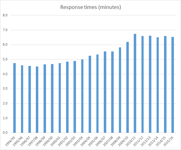
1 Some fires are excluded when calculating average response times. Please see definition document for a more detailed explanation.                                                                         

2 Primary fires are those where one or more of the following apply: i) all fires in buildings outdoor structures and vehicles that are not derelict, ii) any fires involving casualties or rescues, iii) any fire attended by five or more appliances                                                                

3 The largest components of 'other buildings fires' are incidents in private garden sheds, retail and food/drink buildings

4 Typically outdoor fires that are ‘primary’ because of a casualty or casualties, or attendance by five or more appliances5 Typically outdoor fires not involving property                                                                        

Definitions

1 Primary fires are defined as fires that meet at least one of the following conditions:                                                                                

(a) any fire that occurred in a (non-derelict) building, vehicle or outdoor structure,                                                                                

(b) any fire involving fatalities, casualties or rescues,                                                                                

(c) any fire attended by five or more pumping appliances.                                                                                 

2 Includes fatalities marked as "fire-related" but excludes fatalities marked as "not fire-related". Those where the role of fire in the fatality was "not known" are included in "fire-related". Fire-related deaths are those that would not have otherwise occurred had there not been a fire. i.e. ‘no fire = no death’.                                                                                

3 Dwellings includes HMOs, Self contained Sheltered Housing, Caravans/mobile homes, Houseboats, Stately Homes and Castles (not open to the public).                                                                                

4 If more than one smoke alarm was recorded for a fire, the fire is categorised under the most positive operation status of all the smoke alarms recorded.                                                                                

The data in this table are consistent with records that reached the IRS by 4th January 2017.                                                                                 

1 Accidental is defined as when the motive for the fire was recorded as either Accidental or Not known. As such this excludes deliberate fires.                                                                                                        

2 Other breathing difficulties includes: Choking and Other breathing difficulties.                                                                                                        

3 Physical injuries includes: Back/neck injury (spinal), Bruising, Chest/abdominal injury, Concussion, Cuts/lacerations, Fracture, Head injury, Impalement and Other physical injuries.                                                                                                        

4 Other includes: Collapse, Drowning, Heat exhaustion, Hypothermia, Other and Unconscious.